The question, and why it resists a single answer
“Where should large-scale computing infrastructure be built?” is the defining infrastructure question of the AI buildout, and it has no scalar answer. A site that is perfect on power can be disqualified by water; one with cheap land and generous tax incentives can sit an unacceptable distance from the fiber and internet exchanges that determine latency; a location safe from wildfire may sit on a seismic hazard that raises construction cost beyond the land savings. Siting is irreducibly multi-dimensional, and the honest tool for it is not a leaderboard that collapses those dimensions into a rank — it is an instrument that keeps them visible and lets a human weigh them.
That is what Data Center Intelligence is: the first real investigation built on Smoking Mirror’s Infrastructure Intelligence framework, assembling roughly eighteen independently toggleable layers over a single map so the trade-offs can be reasoned about directly.
Why not a ranking
It would be easy — and it would be wrong — to weight these layers and emit a “top 10 places to build.” The weights that would drive such a ranking are exactly the thing that differs between builders: a hyperscaler training frontier models optimizes for power and cooling above almost everything; a latency-sensitive edge operator inverts that, prioritizing proximity to population and internet exchanges; a sustainability-constrained operator treats water stress and grid carbon intensity as hard limits. A single ranking encodes one set of priorities and hides it inside an apparently objective number. Keeping the layers separate and toggleable keeps the priorities where they belong — with the person making the decision.
The three layer groups
Infrastructure — what already exists to build against
Seven layers describe the built environment a new facility plugs into: existing data centers and cloud regions (where capacity already clusters, for better and worse), hyperscaler campuses (where the largest buildouts are going), power plants and transmission lines (the binding constraint of the era — a site is only as buildable as its access to firm power), the fiber backbone, and internet exchanges (which, with fiber, set achievable latency). Power and connectivity are the two hardest infrastructure gates, and both are here as first-class layers.
Climate and hazard — what threatens the investment
Five layers describe environmental risk over the facility’s multi-decade life: wildfire, drought, flood, earthquake, and water availability. Water earns its place twice over — as a hazard when scarce and as a resource constraint, since large facilities that use evaporative cooling draw heavily on it, and siting into a water-stressed basin is an operational and reputational risk [@wri_aqueduct]. The hazard layers here are illustrative; in live operation they map to FEMA’s National Risk Index, USGS seismic models, and USFS wildfire data [@femanri; @usgs_nshm; @usfs_wrc].
Human factors — what makes a site viable and permitted
Six layers describe the human and economic terrain: land availability, population (both a workforce source and a nuisance-and-permitting factor), workforce depth, tax incentives, and latency to major metros. These are the layers that turn a physically buildable site into a viable one — and the ones most often reduced to a sales pitch. Keeping them as data, next to the hazards, is part of the discipline.
The dashboard
Toggle any layer independently; the three groups organize them but impose no hierarchy. The date selector replays past immutable snapshots. Nothing is scored.
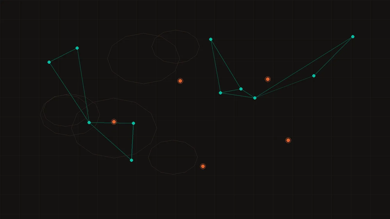
Data Center Intelligence — layered siting map (sample data)
Open full screen ↗What the sample cannot tell you
The gap between this prototype and a real siting decision is worth stating plainly, because it is where the hard work lives. Real siting turns on parcel-level land and zoning, not the illustrative polygons here; on the grid interconnection queue — the multi-year wait for a transmission connection that has become the true bottleneck — which no public map fully captures; on water rights, not just water stress; and on the private, negotiated economics of power-purchase agreements and incentive packages that never appear in any feed. The sample demonstrates the reasoning structure. The live sources below are what make it decision-grade.
Live data sources this maps to
-
Infrastructure
Power, grid, connectivity
EIA generation data; HIFLD/OSM transmission; PeeringDB for internet exchanges; provider region lists; OSM for data centers.
-
Climate & hazard
Risk models
FEMA National Risk Index (wildfire, flood, drought); USGS National Seismic Hazard Model; WRI Aqueduct and USGS for water.
-
Human factors
People and economics
Census ACS for population and workforce; BLS QCEW for labor depth; land cover from NLCD; incentives compiled manually.
Each layer in the engine’s catalog names its live source and the credential
it needs; the module README lists them in full, and the .env.example maps
every credential to its layer. Swapping a layer from sample to live is a
per-layer connector, not a rewrite — the framework’s whole point.
Roadmap
-
Phase 1 — shipped
Decision-support platform on sample data
17 toggleable layers across three groups; immutable snapshots; lazy-loaded geometry; no ranking.
-
Phase 2
Live infrastructure layers
EIA power, PeeringDB exchanges, OSM data centers and transmission against real endpoints.
-
Phase 3
Live hazard and human layers
FEMA NRI, USGS seismic, Census ACS — the calibrated risk and demographic layers.
-
Phase 4
Analyst scenarios
Saved layer combinations expressing a builder’s priorities — still surfacing trade-offs, still not auto-ranking.
The platform’s stance is its most important feature: it equips a decision without pretending to make it. In an infrastructure debate saturated with confident rankings, an instrument that keeps the trade-offs visible and the judgment human is the more honest contribution.