Not a map of flames
Every fire season, the same map goes viral: a continent stippled with red dots, usually under a headline implying the world is burning from edge to edge. The dots are real data — satellite thermal detections, most often from NASA’s FIRMS system [@firms] — but the map is a misreading of them. A red dot is not a wildfire. It is a statement that a sensor pixel, somewhere between 375 meters and a kilometer on a side, radiated enough energy in the right wavelengths, at the moment a satellite happened to pass overhead, to trip a detection algorithm. Some of those pixels are megafires. Some are agricultural burns proceeding exactly as planned. Some are gas flares that will still be “burning” on the map next year.
Wildfire intelligence is the discipline of turning those dots — together with incident reports, mapped perimeters, weather, fuels, terrain, and smoke — into statements that are actually true, delivered with their uncertainty attached. It is less like watching a radar screen and more like assembling a case: each data layer is a witness with known biases, and the craft is in the cross-examination.
This piece does two things. It walks through each layer of a modern wildfire intelligence picture — what it can honestly tell you and what it structurally cannot — and it ships a working prototype dashboard that puts those layers on one map, with the caveats built into the interface instead of buried in a footnote.
What the dashboard is trying to model
The prototype models a simple but demanding question: given everything observable right now, what is the most defensible picture of fire activity in a region, and how confident should anyone be in each part of it?
That framing forces three design commitments. First, layers stay visually distinct — a detection never masquerades as a perimeter, and a warning zone never reads as a fire. Second, every layer carries its freshness: data age is part of the data. Third, the interface states its own limits. A “known limitations” panel is not a legal disclaimer; it is a load-bearing part of the product. A fire map that hides its uncertainty is not simplified — it is wrong in a way its readers cannot detect.
The prototype is scoped to the United States first, because the US has an unusually complete public data stack: national incident reporting, an interagency perimeter service, and a weather service that issues fire-specific warnings with published geometries. The final sections sketch how the same architecture extends globally, where the stack is thinner.
The layers
Satellite active fire detections
The foundation layer is thermal anomaly detection from polar-orbiting satellites. The MODIS instruments on Terra and Aqua have provided global active fire detections at roughly 1 km resolution since the early 2000s [@giglio2016]; the VIIRS instruments that succeeded them detect at 375 m, small enough to catch fires MODIS misses and to sketch the rough shape of large ones [@schroeder2014]. FIRMS distributes both in near real time, typically within a few hours of the satellite overpass [@firms].
What this layer can tell you: that something hot existed inside a pixel footprint at overpass time, anywhere on Earth, with no ground infrastructure required. For remote fires, a satellite detection is routinely the first evidence anyone has. Fire radiative power — an estimate of emitted energy per pixel — adds a rough intensity signal, and repeated detections across passes sketch a fire’s persistence and direction of growth.
What it cannot tell you is most of what the viral maps imply. A detection is not a perimeter: the pixel is coarser than most fires, so the dot’s location can be hundreds of meters from any flame. Polar orbiters see a given point only a handful of times per day, so a fire can ignite, run, and lie down between passes. Cloud and heavy smoke block detections entirely — the worst fire weather often produces the worst observing conditions. Small, cool, or understory fires slip below the detection threshold, and the opposite error is just as routine: flares, hot industrial surfaces, and sun glint produce false positives that the confidence flags only partially screen.
Incident reports
The second layer is human: incidents reported through dispatch and tracked in interagency systems, published for the US through NIFC’s Wildland Fire Open Data program [@nifc]. An incident record carries what satellites cannot — a name, a discovery time, an estimated size, a containment percentage, a cause under investigation, and the implicit statement that people are engaged with this fire.
Its limits are equally human. Incident data reflects what has been reported and entered, so it lags reality in fast-moving situations and thins out where response capacity is thin. Size and containment figures are periodic estimates, not measurements; they can hold steady for a day not because the fire held steady but because no update was filed. And an incident point is a point — one coordinate standing in for an event that may span a mountainside.
Perimeters
Mapped perimeters are the closest thing the stack has to ground truth: polygons produced from infrared flights, GPS traverses, and imagery interpretation, published for US incidents through the same NIFC services [@nifc]. A perimeter answers the question the detection layer cannot — where is the edge — and the difference between yesterday’s and today’s polygon is the most honest growth measurement available.
But perimeters are episodic. They are flown and drawn on an operational cadence, typically daily for staffed incidents and not at all for unstaffed ones, so a perimeter is a snapshot that ages from the moment of capture. The polygon’s precision also varies with its method — an infrared flight traced at night and a hand-sketched line from a briefing map can sit in the same layer wearing the same confident geometry. This publication’s earlier work on perimeter accuracy is, in effect, a case study in taking that geometry too literally.
Fire weather
The National Weather Service issues fire weather watches and Red Flag Warnings when wind, humidity, and fuel conditions align for dangerous fire behavior, with zone geometries published through its public API [@nws]. This is the stack’s forward-looking layer: everything else describes fire that exists; fire weather describes the conditions under which fire will behave differently.
Its limit is that it is a forecast of conditions, not of fires. A Red Flag Warning over a quiet landscape usually stays quiet; the warning marks elevated conditional risk, not prediction of ignition. Zone geometries are also administrative — forecast zones, not physical boundaries — so the crisp polygon edges mean less than they appear to.
Fuels and terrain
Beneath the dynamic layers sit the slow ones: vegetation, fuel models, and topography, published for the US by the LANDFIRE program [@landfire]. Fuels and terrain are what turn a weather forecast into a behavior expectation — the same wind means different things in cured grass, in beetle-killed timber, and on a north-facing slope. In the prototype these appear only as a roadmap item, because using them honestly means running them through fire behavior models rather than painting them on a map as if raw fuel class were readable by a general audience.
The layer’s limit is currency. Fuels data is compiled over multi-year cycles; last season’s burn scars, this spring’s grass crop, and last month’s thinning project may all be missing. Terrain does not change, but fuel is a living inventory audited on a schedule.
Smoke
Smoke is the layer the public actually experiences. Model products such as NOAA’s HRRR-Smoke forecast plume transport, and satellite imagery shows where smoke is now. But smoke belongs in a fire intelligence system with a warning label: plumes travel hundreds of miles, so smoke overhead says little about fire nearby, and dense smoke actively degrades the detection layer underneath it. The prototype leaves smoke as a documented stub for exactly this reason — it is the easiest layer to add and the easiest to misread.
Human and operational context
The last layer barely qualifies as data: resource commitments, evacuation statuses, management strategy, jurisdiction. It is the layer that explains why two fires of identical size are entirely different events — one burning into wilderness under a monitoring strategy, one burning toward a town under full suppression. No public feed captures this cleanly. The honest design choice is to link outward to incident information systems rather than pretending to summarize command decisions from structured fields.
What the layers can tell us — together
Fusion is where the picture becomes more than its parts. Detections without an incident record flag possible new starts worth watching. An incident with clustered high-confidence detections outside its last perimeter suggests growth since the polygon was flown. Detections inside a Red Flag zone carry different weight than the same detections under calm conditions. Each cross-reference is a small inference with stated assumptions — which is what distinguishes intelligence from decoration.
Two properties make these inferences defensible. They are directional rather than quantitative: “detections beyond the mapped edge” supports “probably grew,” not “grew by 340 hectares” — the pixel geometry cannot carry the second claim. And they are time-stamped on both sides: a detection from this morning compared against a perimeter flown two nights ago is a comparison across a 36-hour gap, and the inference inherits that gap. A fusion system that displays the conclusion without the gap has quietly upgraded its own confidence. The prototype does not yet compute these rules — they arrive in a later phase — but the schema is designed so that every derived flag will carry the timestamps and source records it was computed from.
What the layers cannot tell us — even together
No fusion of these sources yields house-level threat assessment, real-time fire-front position, or evacuation guidance. The stack’s combined refresh rates — hours for detections, an operational day for perimeters — are simply slower than fire under wind. Anyone presenting these layers as a live tactical picture is claiming a temporal resolution the physics of the data does not support. The prototype’s job is to make that gap visible, not to paper over it.
Dashboard walkthrough
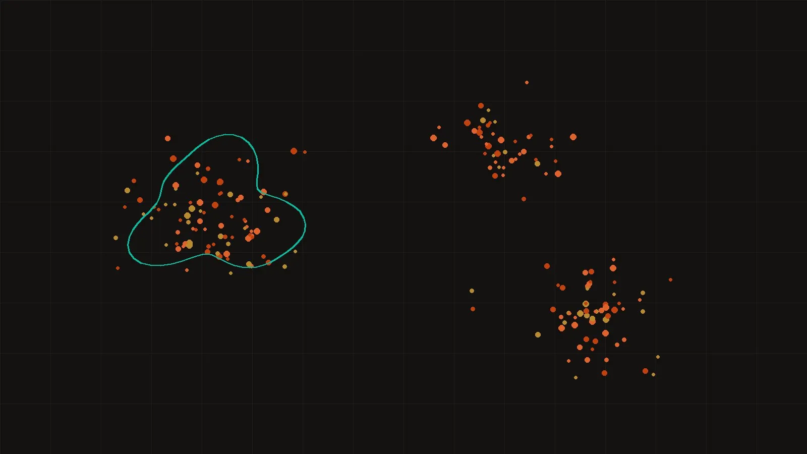
The prototype below is live in the page and runs on the synthetic sample set described in the methods note. The layer toggles control the four evidence types; the filters cut detections by date, confidence class, instrument, and state; the summary cards recompute against whatever is visible. The legend separates the vocabularies deliberately — filled dots for detections, open teal rings for incidents, solid ember lines for perimeters, dashed ochre for warning zones — so no layer can impersonate another at a glance.
Wildfire intelligence dashboard — prototype on sample data
Open full screen ↗The sample set itself is documented, checksummed, and downloadable — both for inspecting what the prototype renders and as a fixture for anyone extending the code:
A proposed US architecture
A production national system needs surprisingly little invention; the US layers exist and are public. The architecture is a pipeline, not a platform: a scheduled ingester pulls FIRMS detections, WFIGS incidents and perimeters, and NWS alert geometries on their natural cadences; a normalizer maps each into a common event schema with source, timestamp, geometry, and uncertainty class; a small rules layer computes the cross-references described above; and a static or cached tile front end serves the result. Every derived statement keeps a pointer to the raw records behind it, so the system remains auditable down to the pixel. The prototype’s data-source registry is a deliberately miniature version of that ingest tier.
The operational costs are modest and worth stating, because they shape what the system can promise. Detection ingestion is bounded by FIRMS’s near-real-time latency, not by anything a builder controls; perimeter ingestion is bounded by incident mapping cycles; so the pipeline’s honest refresh promise is “as fresh as the slowest layer you are currently looking at,” which is why per-layer freshness belongs in the interface. The other cost is archival: a system that only shows now cannot answer how did this develop, and retrospective analysis — the kind this publication exists to do — requires keeping every ingested snapshot. Storage is cheap; the discipline of versioning every layer from day one is the actual investment.
A pathway to global coverage
The detection layer is already global — FIRMS covers the planet with the same sensors. What thins outside the US is everything else: few countries publish incident feeds or perimeter services, and warning products vary in format and existence. The pragmatic global architecture treats Copernicus’s Global Wildfire Information System and the European EFFIS service it grew from as the incident-and-danger backbone where national feeds are absent [@gwis], accepts that perimeter-grade truth will be missing across most of the map, and says so on the map itself — coverage honesty as a first-class layer. A global system that renders Oregon and a data-sparse region with the same visual confidence is lying about one of them.1
Data ethics and operational caution
Fire data is consequential in ways a dashboard builder must respect. Over-reading detections spreads alarm; under-reading them breeds false calm; and a polished interface manufactures authority whether or not the data underneath deserves it. The design responses in this prototype are simple and repeatable: sample data is labeled at the point of display, not just in documentation; the limitations panel ships inside the product; freshness is rendered next to the numbers it qualifies; and the interface links toward authoritative operational sources rather than positioning itself among them. There is also a quieter obligation — incident data can intersect with private land and with people’s worst days, and aggregation choices should remember that.
Roadmap
-
Phase 1 — shipped
Prototype on sample data
Leaflet interface, four layers, filters, limitations panel; the subject of this article.
-
Phase 2
Live keyless layers
NWS Red Flag geometries via the public alerts API; scheduled fetch with graceful fallback to samples.
-
Phase 3
FIRMS and WFIGS ingestion
Keyed FIRMS area queries and NIFC ArcGIS REST pulls through a small server-side cache; freshness computed from real timestamps.
-
Phase 4
Fusion rules and history
Detection-vs-perimeter growth flags, new-start candidates, and a rolling archive for retrospective analysis.
-
Phase 5
Global tier
GWIS/EFFIS backbone outside the US, with explicit coverage-honesty rendering.
The through-line of the roadmap is the through-line of the article: every phase adds capability by adding stated uncertainty, never by hiding it. A wildfire intelligence system earns trust the way any witness does — by being precise about what it saw, and more precise about what it didn’t.
Footnotes
-
Coverage asymmetry is itself information. EFFIS-style danger ratings exist for much of the world, but perimeter services comparable to NIFC’s are rare; a global map should render that difference rather than interpolate over it. ↩
From this investigation
CSVGeoJSON